


Details
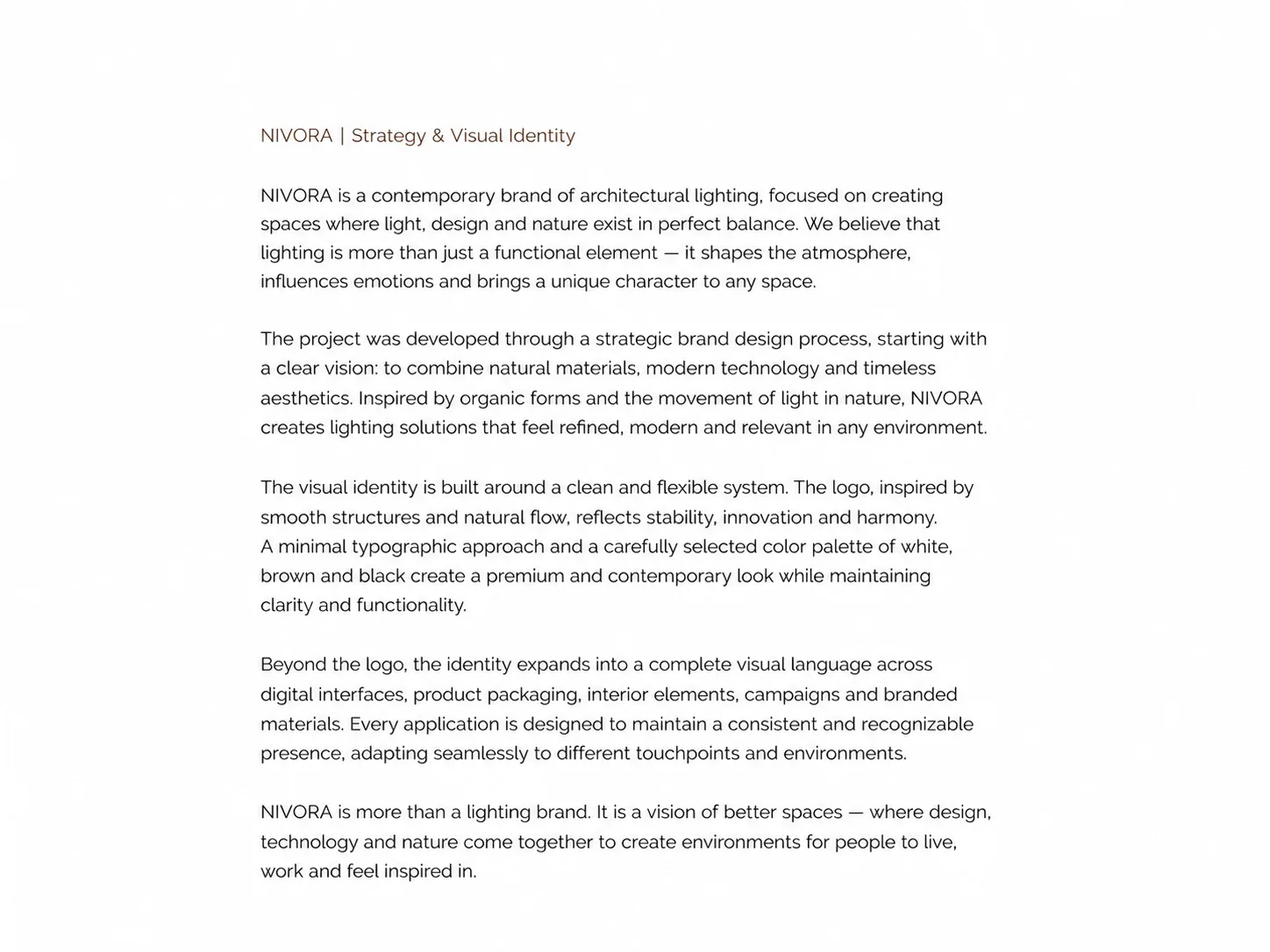
Brand identity: strategy, logo, palette, typography and application.
About
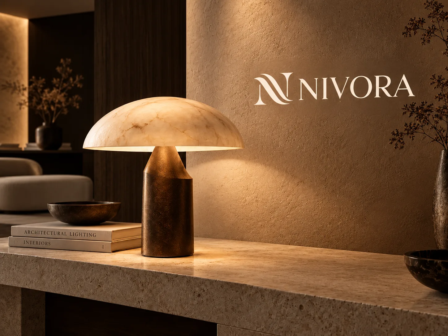
NIVORA is a brand identity project for an architectural lighting brand. The brand rests on a balance of light, design and nature: natural materials, warm light and restrained typography.
What's inside
- Strategy and visual identity: a short brand introduction
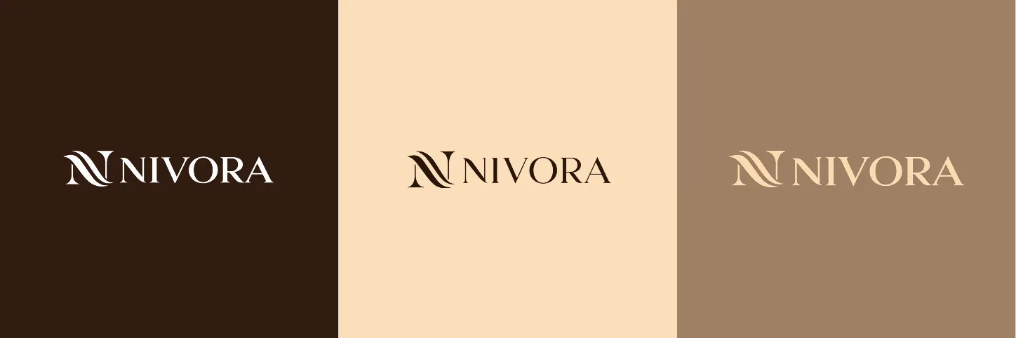
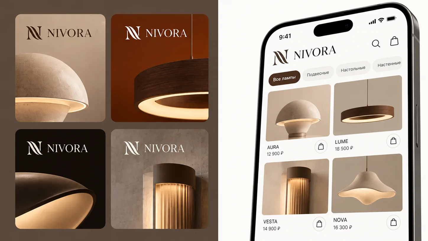
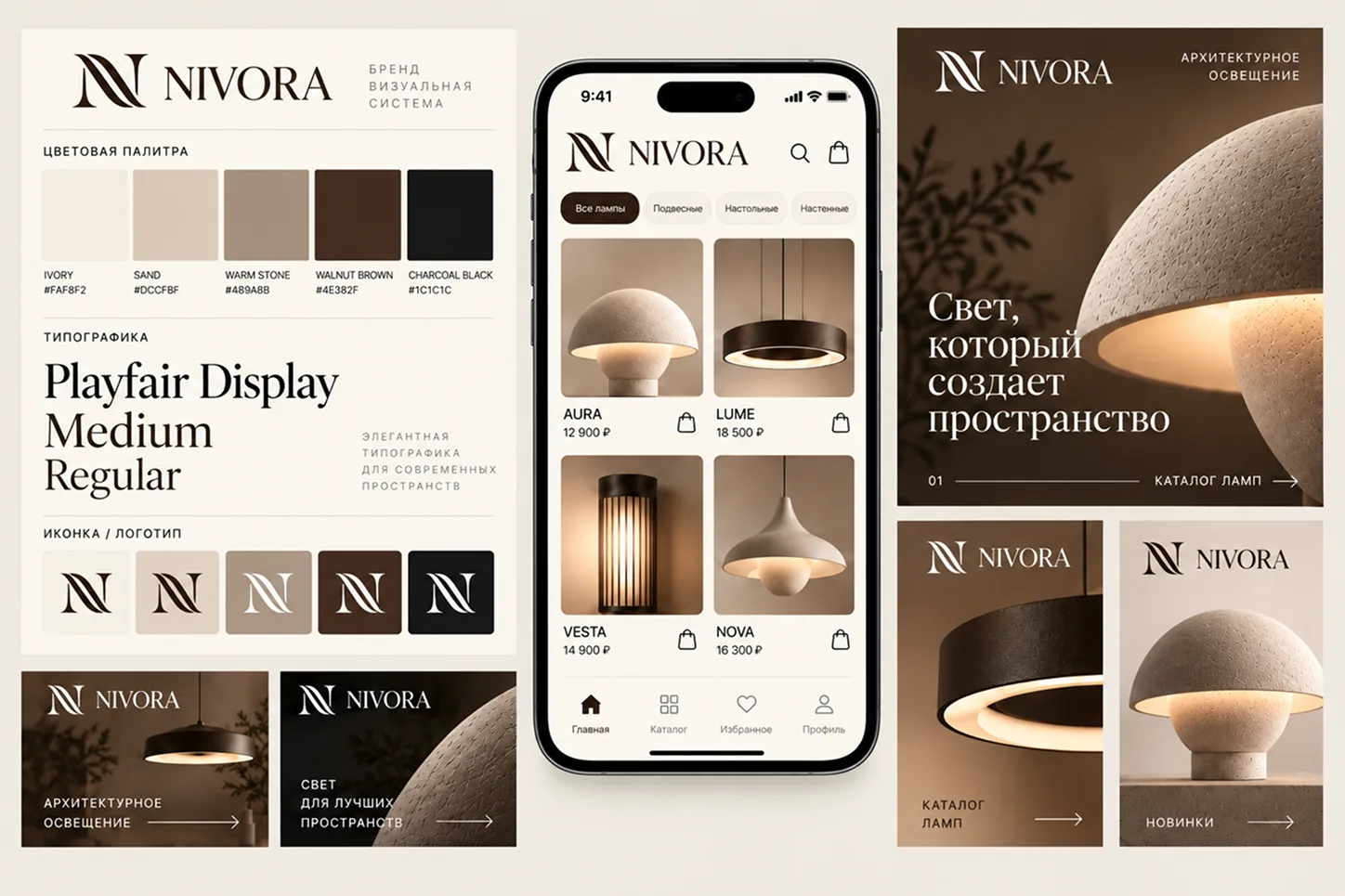
- Logo: the N monogram and the NIVORA wordmark on dark, cream and beige backgrounds
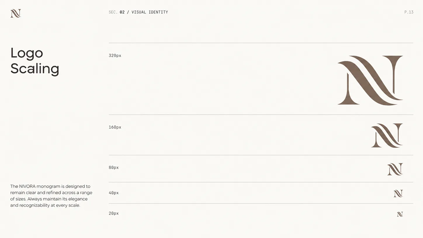
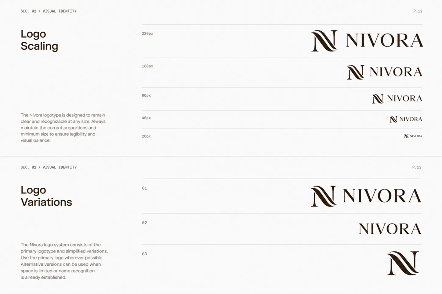
- Logo variations and scaling from 320 down to 20 px
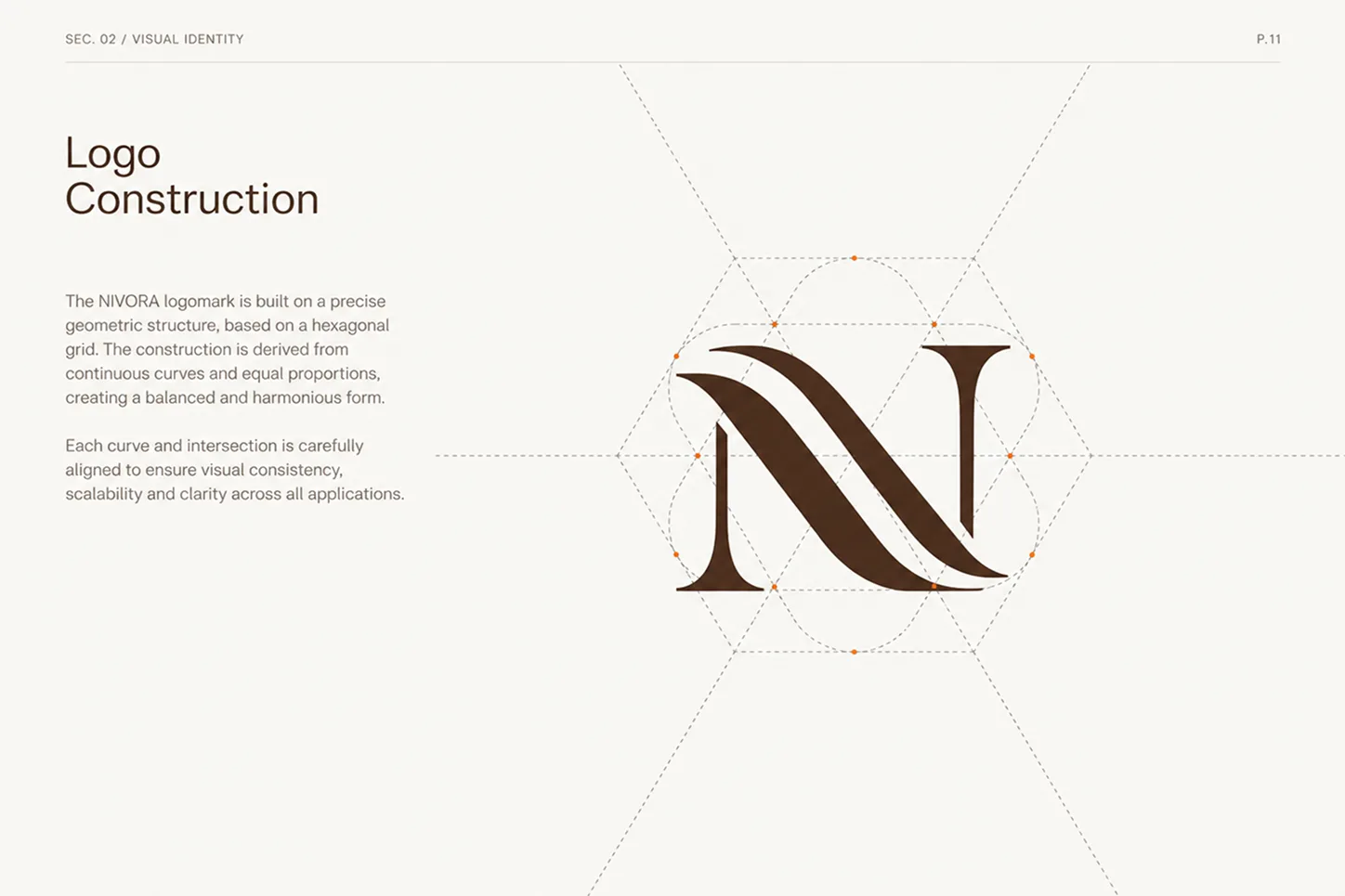
- Logo construction on a geometric grid
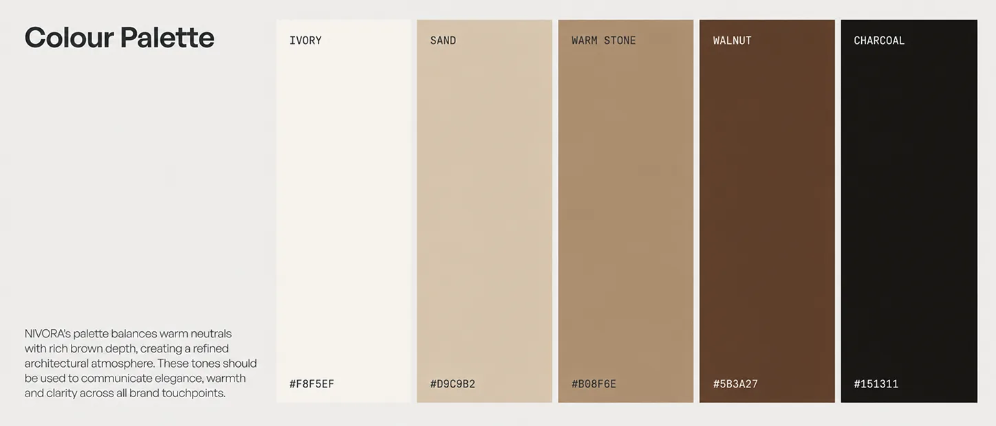
- Palette: brown, cream, beige and dark neutrals
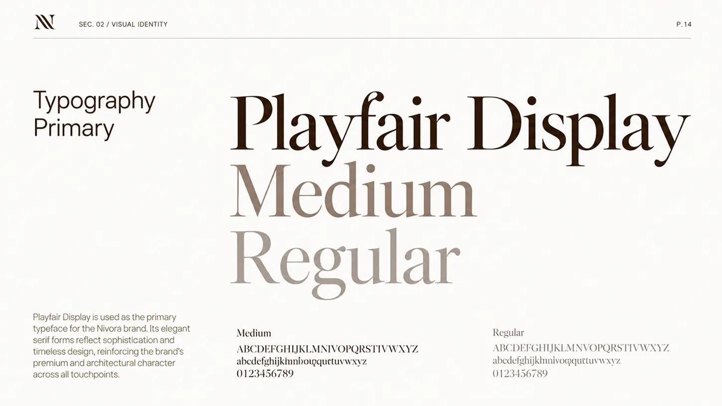
- Typography: Playfair Display (Medium, Regular)
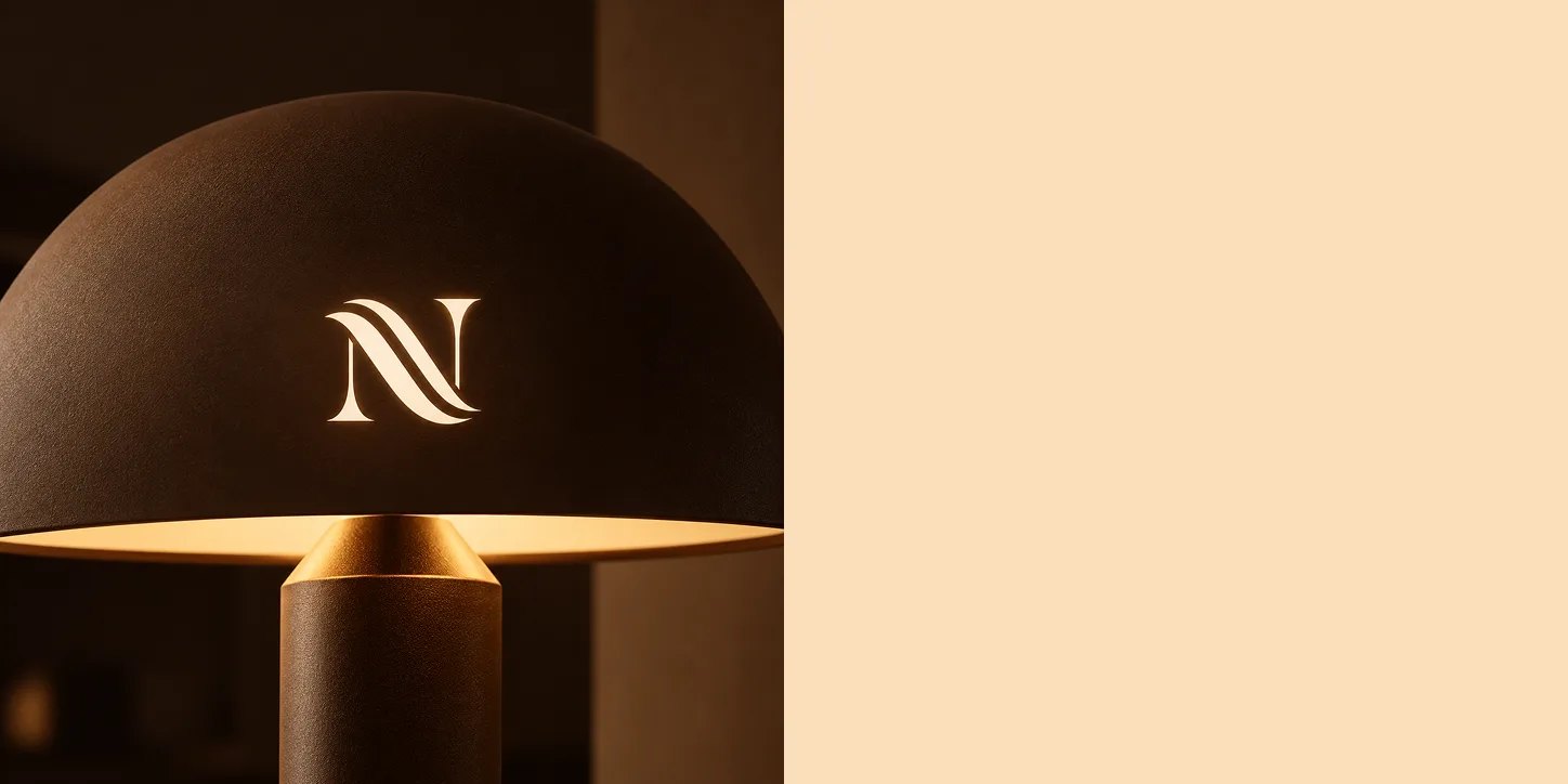
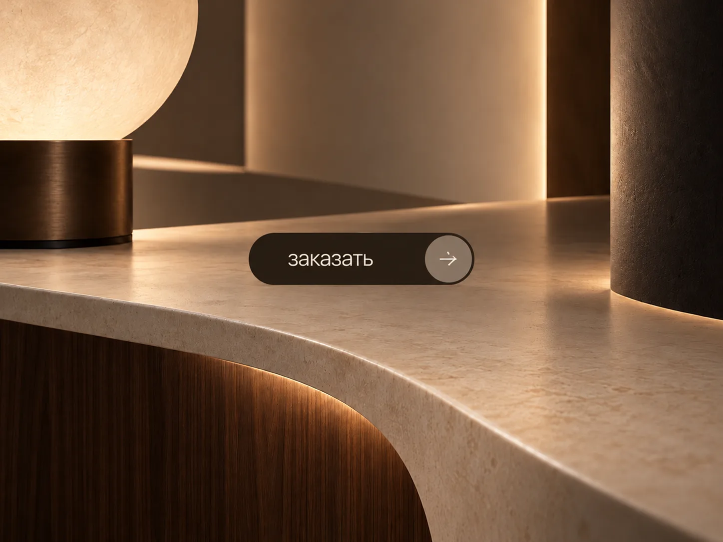
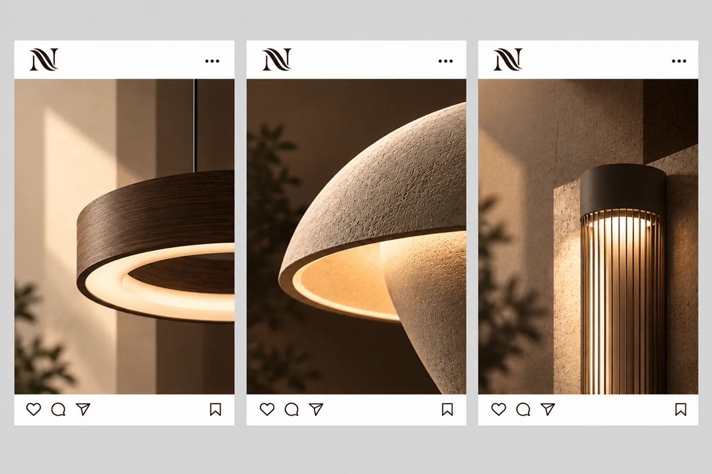
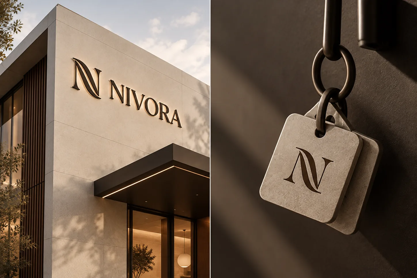
- Application: a mobile app for a lighting catalogue, social media posts, promo photos, a building facade and a logo key tag
More about the work
The work is built as a brand identity: from a short brand introduction and the logo to the rules for using it. The logo is shown in several versions and on different backgrounds, with a check of how it holds up when scaled down and a construction scheme on a geometric grid. The palette and typography are laid out on separate boards. The layouts and design files were prepared in Figma. Application is shown through examples: a mobile app for a lighting catalogue, social media posts, promo photos of the lamps, a building facade and a logo key tag.
TIVONIX role
Visual identity and design.